Susanne
Komorek
Corporate Identity
Brand Strategy
Digital Design
UI Design
©2024
made in Berlin
I am An
Art Director
Specialized in
Branding and
Digital Design
Identity & branding
Based on in-depth market and target group analysis, i develop branding strategies and visual identities.
Creative Direction
I can lead a team of different design professionals and ensure that all design applications are integrated into the overall corporate identity.
UX Design & Web Development
I have 15 years of experience in building identities across all media channels, with digital applications UX and web design being my core competence.
work
work
(selection
2014-2024)
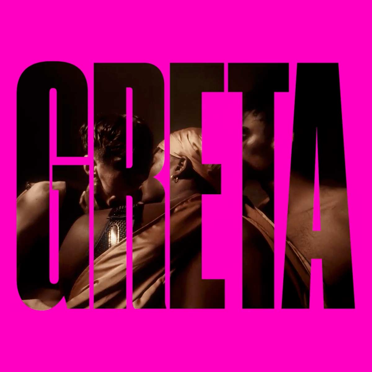
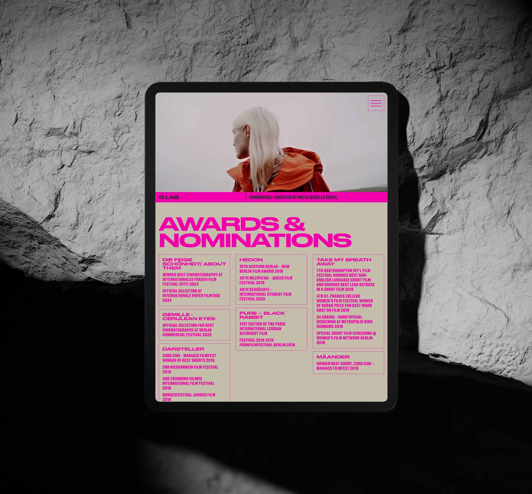
Greta Isabella Conte
Greta is a Berlin based cinematographer and artist. She was looking for a strong visual language to underline her artist identity.

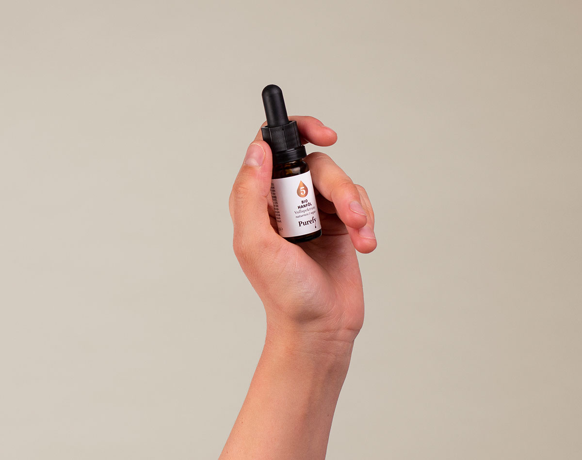
Purefy
Purefy is a startup that distributes high-quality organic oil. The most important property of the identity was the visual accent on the high quality of the oil – grace, purity and health are the central topics of the product.
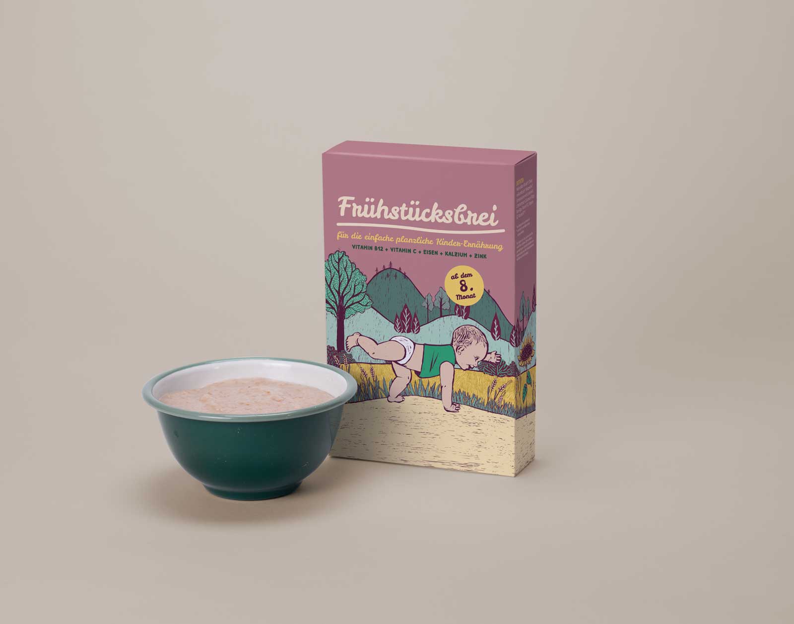
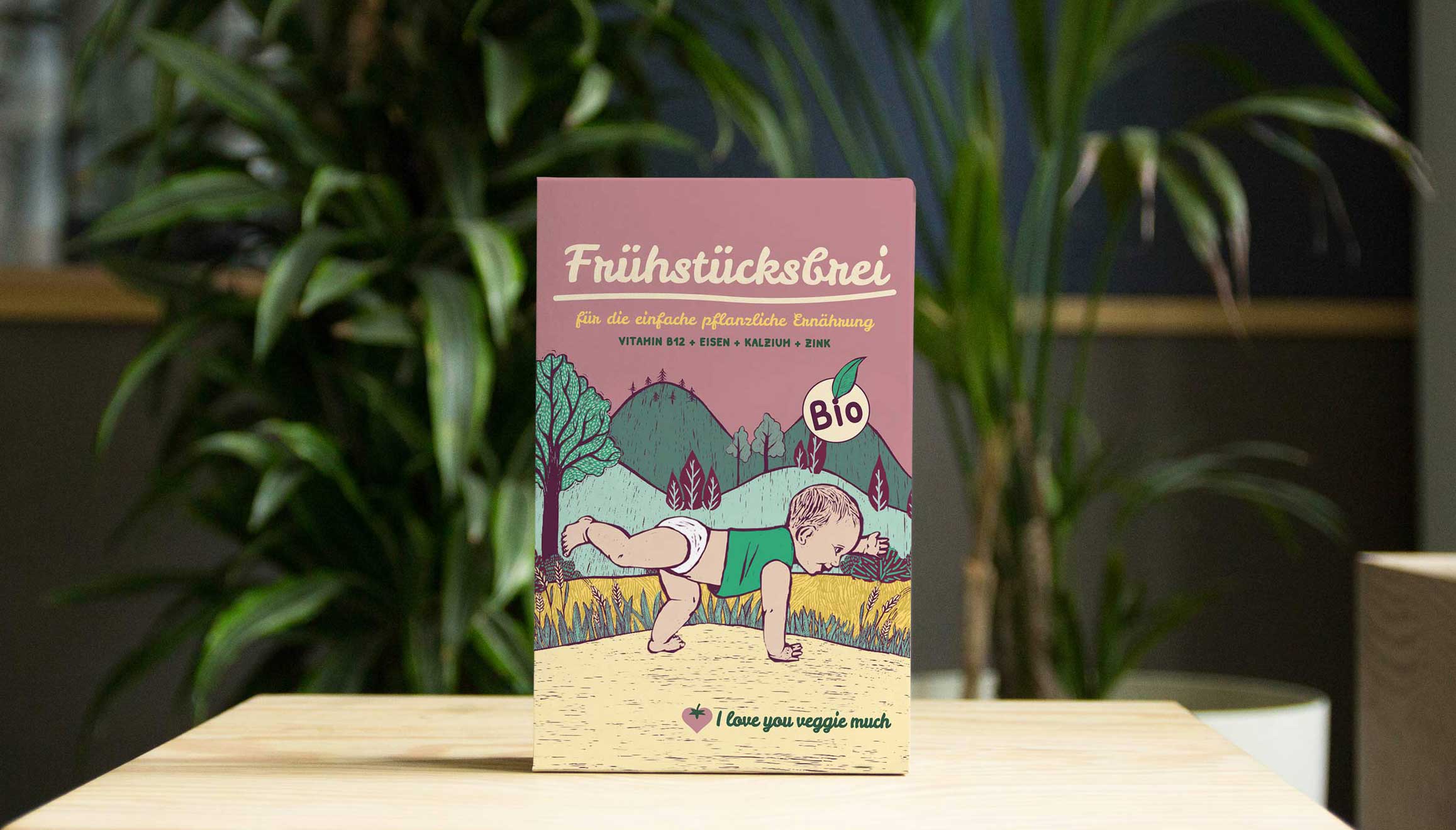
I love you veggie much
I love you veggie much provides organic high quality baby food, that is adapted to a plant-based infant’s diet to prevent deficiencies.The big challenge was to create a brand that wins with seriousness as much as with a loving, authentic and fair identity.
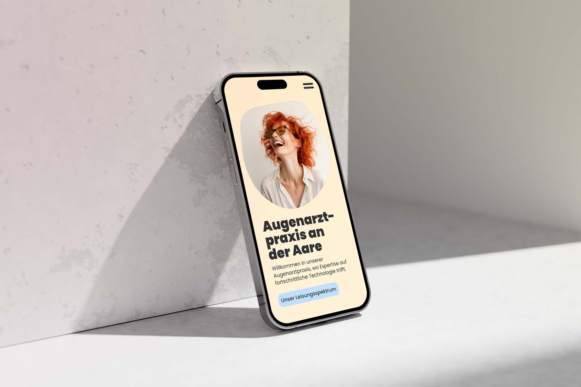
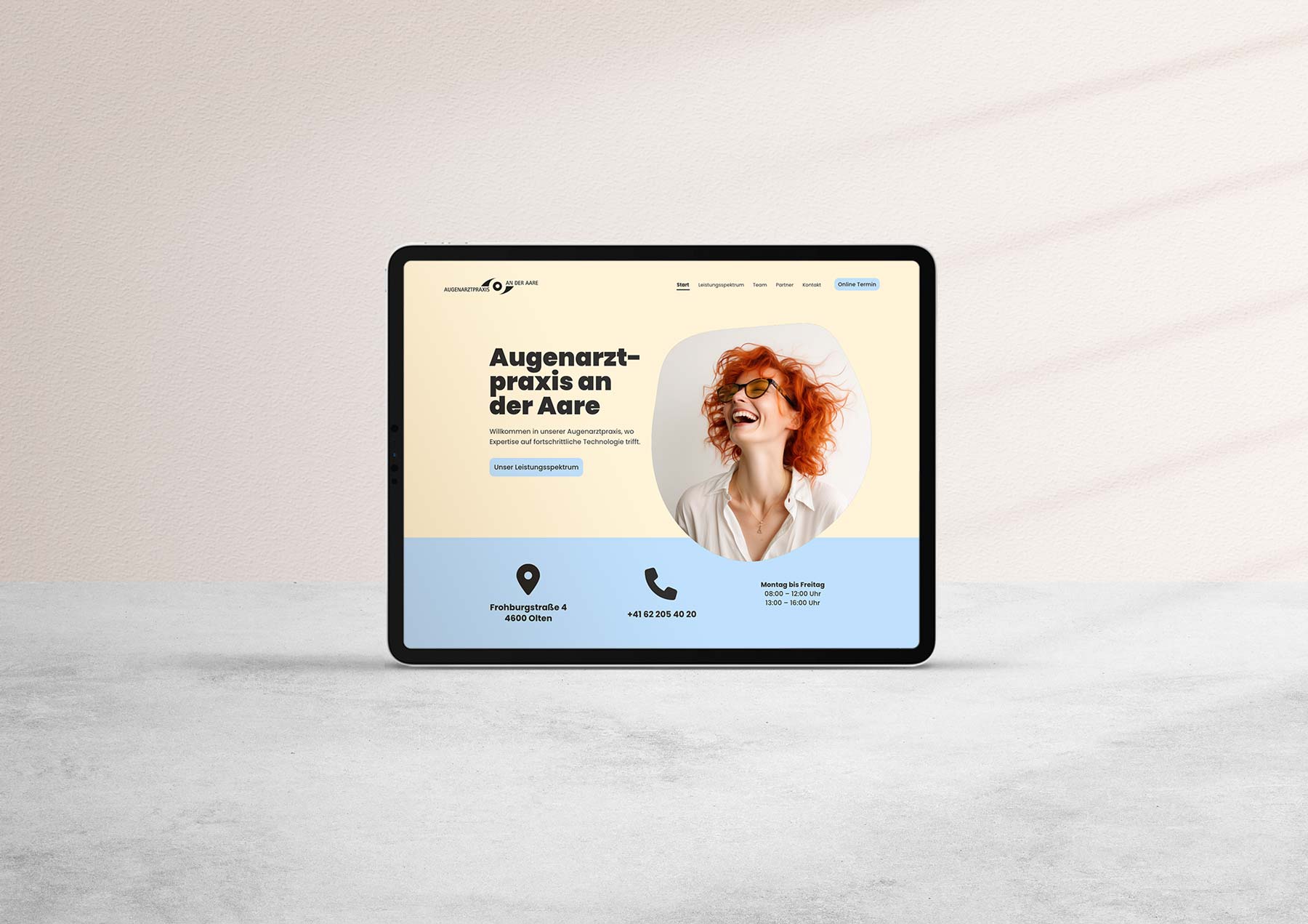
Augenarztpraxis an der aare
After a change of ownership, the ophthalmology practice needed a new website. As an ophthalmology practice, accessibility and good readability of the website are particularly important.
Friendly colors and a high-contrast appearance give the patient a feeling of comfort.
about
01 SKILLS: BRAND BUILDING | UX-DESIGN | WEBFLOW DEVELOPEMENT
Coming from classic corporate design, I have more than a decade of experience in building powerful brands. Over the years, I have specialized in the design and implementation of online applications out of passion. From the first wireframe to the finished website; I can realize your project. I do work mainly with Figma, XD and Webflow.
02 Experience
After graduating from the University of Applied Sciences Mainz in 2014 (B.A. Communication Design), I have worked for large clients like WDR and NDR as passionately as I have for medium-sized companies, agencies and Start-Ups.
I have a big network of professionals in design, social media, film and marketing that I frequently collaborate with.
03 MINDSET
I work globally. I travel everywhere. My heart beats most for Start-Ups as I have already founded one myself. I have internalized the mindset of entrepreneurs and terms like scalability, KPIs and market analysis are my daily business. I am on fire for what I do. When I jump on your project, I will offer 100% dedication and commitment.